The Art Gallery Hub
{ Converting web visitors into seasoned collectors
Does your site's navigation still resemble the game of goose?
Ever heard about the game of goose? It was one of those iconic European board games played during winter evenings. The game displays a spiral track of numbered spaces the players move on with as little as possible throws towards the winning case.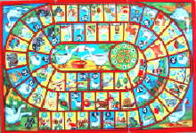 Depending on which space players land on they can move on or are forced to move backwards. There is no escape possible, no short cuts allowed.
Well... cheating, especially taking a short cut when no one paid attention, was part of the game too. No need to describe the scenes of 'despair' near the finish when you hit a penalty forcing you to start all over again.
Most navigation designs are set up along the same very narrow path
They take the visitor level by level, deeper and deeper into the content. Much like the spiral in the game of goose. Once on the track, there's no escaping. The only way to progress and continue...is to go back.
Forward-backward and that's it. Why penalise your visitors?
Forward-backward, or up and down if you like, was long considered the easiest and most controllable way to ease navigation. All your visitors can do is advance along the 'secured' path deeper and deeper into the content. No possibility to pull to the right or switch to the left. Easy enough, but...
Not only is it very restrictive, it is also an open invitation to quit
Take a typical artists' section on a gallery site. If a visitor wants to look up another artist, he has to return to his starting point - the main artists' page - and restart his tour all over.
Forcing your visitor to cut his visit in little chunks is presenting him with as many occasions to quit.
Instead of imposing a strict navigation, become your visitor's discrete guide
The whole concept is to offer your visitor a truly flexible approach to visit your site, one that he can make up s he goes, eliminating a strict path to follow. On each page your visitors can choose instinctively what they want to do next. Without a nano second of hesitation.
In such an approach you eliminate dead ends. You can even remove any 'back button' as the ultimate way-out by offering all possibilities to navigate freely in the course of his visit.
In web terms it's called 'weaving'
Instead of interrupting a visit time after time in an abrupt way risking that your visitor will quit, on each page you seduce him to continue the visit by offering some extra suggestions to discover another aspect of your artists or of your gallery.
Going with the flow of your visitors?
How can you possibly succeed to offer them endless opportunities to wander through your site as they like? From artist's work to publications, over biography to past exhibitions or news about the artist without noticing they are leaving the level they're on, without clicking on a button, in one uninterrupted go?
The idea comes from nature
We're on the web aren't we? The basic principle of the web is that all pages are linked with each other, much the same way as a spider produces its web. A spider can't possibly predict where its prey will land. For maximum accuracy it wants to be able to cross to the prey via the shortest distance. Not only via the main or radial threads that form the structure of his web, but also via the secondary or spiral threads, the side-ways.
Weaving creates a completely different sensation
If visitors prefer to consult the biography instead of look up a catalogue, want to read the latest news about the artist instead of discovering other works, it's all within the reach of the page they are on via a text link on the page.
Weaving is about guiding your visitor
Suggestions or hints within the flow of the text create a completely different experience. Instead of forcing your visitor to look up and search on the page where he could go next, you guide him almost unnoticeably. It's a natural, more intuitive approach.
Moreover, by linking all related elements on a same level for the visitor, they get the complete picture on what your site offers for example about an artist in a single go.
So what, isn't it what you offer already?
Look more closely. On your artist's page you have indeed links or buttons to look up a biography or a curriculum. But these are presented as separate links; they are not integrated in the flow of the page. They force your visitor to 'quit' what they are viewing.
If he wants to consult a catalogue, a publication or the latest news about an artist, on most sites he even has to go via the main menu. It's much like leaving an exhibition to enter the bookshop of the museum gallery via the entry hall.
All you need is to add little extras in your body texts
Don't touch your navigation or adapt the existing 'silo' structure of your site. Consider menus as service stairs, short cuts that remain fully functional in case they prefer to cut short the visit on that particu lar path.
Keep it simple
The whole idea is to build-in extra 'doors' that remain permanently open via text links in your existing body texts or via some catchy lines that contain the text links.
Avoid by all means adding extra buttons, signs or other links on the page. Separate extra buttons only increase your visitors' indecisiveness by offering them too many choices.
Be aware not to send your visitor in a maze eith er
Therefore you need to do some work 'behind the screen'. Lay-out possible visit paths before you actually start adding text links. What is the most logical trajectory visitors should follow? Any other interesting possibilities? Will they go back at some stages to see some works again? Will they want to compare the bios of two artists?
At some point you will need to limit choices otherwise you risk that your visitor will start running in circles like in a maze.
Always check twice not to send your visitor to a dead end
It's much like the spider which has to fix its web permanently to be sure it remains fully functional. From now on you have to pay close attention to really follow-up your navigation. For example, if you suggest to look up the announcement of the upcoming museum exhibition of an artist, be careful to remove or update the link once the exhibition is over.
And an unexpected bonus on top
Weaving not only offers real visitors a much more natural visit, the browsers’ robots – especially Google bots – appreciate this approach too. Sites with pages that are naturally linked via descriptive lines of text are evaluated much higher by the browsers' robots.
They even give them more 'weight' depending on their position in the general context on the page.
Because the bots try to simulate the behaviour of real persons, they judge interlinked pages more likely to be clicked by a visitor because the contents structure is much more coherent than the sturdy 'silo' approach.
So yes, weaving offers a plus if you plan to work on the search engines optimization of your gallery's site. More on this in another article.
>
Do you want to read one more article ?